Ranking The Shirt | by Pat
In a previous post, the 2005 version of "The Shirt" was awarded one star. Judging from internet message boards and the like, both the color and design are not exactly causing Irish fans to line up at the Bookstore, cash in hand. But where does it fall compared to previous versions of The Shirt? Here now is one man's rankings of one of Notre Dame's newer traditions: The Shirt.
(For any of the shirts, click on the year to bring up a larger picture. These pictures and more info can be found at theshirt.nd.edu)
#1 - 1992 The shirt that solidified "The Shirt" tradition is also probably one of the most inspired. The official induction of Lou Holtz to the pantheon of great Irish head coaches and the declaration that merely playing football isn't tradition at Notre Dame; winning is. An instant classic.
#2 - 2002 Perhaps a controversial pick here, since any mention of "Return to Glory" brings back painful memories of the lackluster Willingham era. But going on design alone, it's still a great shirt. While other shirts reference things like spirit and love, this shirt comes right out with a battle-scarred helmet raised high in victory and a quote from Rockne about destroying your opponent on the field of play. The ghosts of Rockne and the Four Horsemen remind us of ND's rich history while the "Return to Glory" is a public admission of the mistake that was hiring Bob Davie. A great shirt, unfortunately marred by the coach who couldn't live up to its logo.
#3 - 1990 The one that started it all. Nothing pretentious here and no signs of the over-commercialization of later shirts. Just a fun shirt to be worn by students to the game for a good cause. A simple direct front and a "highlights of ND" design on the back make it a great shirt to wear around anytime. Simple and successful.
#4 - 1994 Another shirt that calls upon the past glory of Notre Dame football. The Four Horsemen, Gipp, and Rockne might be a bit oversold when it comes to Notre Dame football paraphernalia, but this is the first "The Shirt" to use them, so it gets a pass. After 1993's attempt at a dark shirt, the color is wisely brought back to something that stands out in the stadium.
#5 - 1996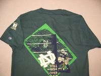 Another green shirt and while it is in the Top 5, it's more of a lack of competition than anything else. Nothing too special about this shirt. Just a solid design that keeps it all about football and doesn't try anything too fancy. Bonus points for taking the "Win Over All" Victory March lyrics out of context. No longer just about Ol' Notre Dame overcoming adversity, it now also clearly spells out what fans expect Notre Dame coaches to do against future opponents.
#6 - 1999 The first non-green shirt on the list, the '99 version took a break from previous designs and opted for the final line from the Alma Mater. Maybe it's a bit sappy, but it's one of the few that I'll still throw on and wear around, so I guess that counts for something. It's also the last shirt to feature the Golden Dome on the front.
#7 - 1993 Just before the mid-way point finds the first shirt to use the a line from the Victory March. The '93 shirt is also the first to use the raised helmet graphic that showed up on the 1999 and 2002 shirt. Other than that, it's a pretty average shirt. The dark color isn't ideal if you want it to stick out in the stadium, but the design itself isn't that bad.
#8 - 2000 Not much to say about this shirt. Another year where they simply took a line from the Victory March, stuck in a picture of some football players, and called it a day. Again, some credit for the green color since it stands out in the stadium (I'll leave the 'but it's not our school colors' complaint for others) Not terribly inspiring, not ugly either. Hence a slot firmly in the middle of our countdown.
#9 - 2004 To be honest, I kind of like this shirt. The previous four in the list are all boring variations on a theme. At least they took a design chance with this one. The decision to include Joe Montana was a nice touch. The line from When Irish Backs Go Marching By is decent change from plucking lines out of the Victory March. But where this shirt goes wrong is the approximately 47 font types used on the front and back. This is probably the shirt that draws the most varied responses. Some love it. Some hate it.
#10 - 2001 Another boring cookie cutter shirt in the mold of #5-8. No surprise this was the last of the "Victory March quote" shirts. A bit odd that they leave the end of the Knute Rockne "Gipper" speech hanging.
To Go In There With All They've GotWin just one? What happened to winning all of them? Was this a subtle attempt by Davie to lower the bar? Hmmm....
And Win Just One...
#11 - 1997
 "Hey I know, let's try teal this year!" Or is that sage? I can't tell. Really, what was the reasoning behind the color of this shirt? The "new" ND lining up against the "old" isn't a bad design, but the color is so atriocious that I really wonder what they were thinking when this shirt got approved. I'm sure someone will undoubtly mention that the color bears a striking resemblance to the name of this blog, but if that is what they were going for, then a Grantland Rice quote might have driven the point home a little better. As it stands now, it just looks they they checked the wrong color box on the order form.
#12 - 1998
 Another ugly color. And people complain about a normal green shirt? The picture makes it look gray, but the one sitting in my drawer is definitely more of faded olive. And the too-cute 1-9-98 uniform numbers? Pass. To be honest, after this shirt and the '97 shirt, they should have just cancelled "The Shirt" project. It's as this point that it really stopped being a student-run fundraiser and turned into a ham-handed administration attempt to force another tradition on ND fans. I still like the idea, but it either needs a breather for a few years or some serious design effort.
#13 - 1991
 I guess this shirt could be ranked higher, but I stuck it here. The main reason being by looking at the back of the shirt you can't tell if it's a football shirt or the logo on school stationary. The Madonna blue is a nice nod to ND's historical school colors, but it also brings Faustian flashbacks for many ND fans. It's not an ugly shirt, but it's also not a football one.
#14 - 2003
 Now we're getting into the shirts that were best left on the design table. The 2003 shirt completes the administration sell-out by quoting (in 5 different fonts) from "Here Come the Irish". And while I still like that cheesy song, the whole idea to use the lyric on the shirt smells of marketing synergy. And to make matters worse, the subtle shamrock design on the front looks like a beer stain out of the corner of your eye. I can't tell you how many times I started to wipe off the front my shirt the first time I wore it.
#15 - 1995
 This is one creepy shirt. The evil, disembodied head of Knute Rockne hovers ominously and seems to crack a smile as a Notre Dame football player is electrocuted by a bolt of lightning. Why Knute, why? Ara could stop the rain. Can't you stop the lightning? And the purple accents are just a great touch considering ND was playing Northwestern in the home opener. If you plan on brainwashing your kids to like ND, keep this shirt out of sight.
#16 - 2005
 Where do I begin? The story goes that the break from the bright color green was to differentiate between the Willingham and Weis eras. However, they still wanted the people who wear the shirt to stick out, so bright yellow (is it supposed to be gold?) was chosen. I suppose it will stick out in the stadium.....if people wear it. The main problem is the ultra-cheesy Joe Theisman quote selected for the back design. It's more suited for a Notre Dame Christmas card than a football shirt. Besides, ND spirit can light up the universe, but we still can't play a night game at home? Whatever. And to put a final nail in the overcommercialization of "The Shirt" project, check out the logo on the sleeve. Could it be any more obnoxious? If they want this tradition to survive, next year's shirt is going to need to be great or else people are just going to stop buying it, or at least stop wearing it to games.
Well, that's my take on things. Disagree with any of my choices? Here's an online poll where you can pick your favorite iteration of The Shirt. When you're done voting, click here for the results. Thanks for playing.
